Lighting shapes how people read, move, work, and feel inside a space. Yet many projects still treat it as decoration added near completion. That approach creates glare, dark corners, wasted energy, and uncomfortable color shifts. The U.S. Department of Energy reports that LED lighting can use at least 75% less energy and last up to 25 times longer than incandescent lighting. Efficiency matters, but it does not excuse poor design. A badly aimed LED remains badly aimed.
This guide examines Lighting Design Mistakes To Avoid through practical, evidence-based decisions. The International Energy Agency identifies lighting as a significant electricity end use, making controls, lamp selection, and operating schedules important design considerations. The Illuminating Engineering Society also provides professional guidance on illuminance, glare, visual comfort, and lighting quality. These standards support a simple principle: measure the task before choosing the fixture. A kitchen worktop needs focused light. A hotel corridor needs safe, even visibility. A bedroom usually needs softer layers and lower brightness.
Small details reveal major problems. A glossy conference table can reflect a ceiling panel directly into someone’s eyes. A cool-white lamp beside a warm-white lamp can make one wall look visibly dirty. I have seen attractive mock-ups fail after installation because real furniture blocked the planned beam angles. That experience deserves attention. Drawings are useful, but site testing is better. This article explores common errors, including excessive brightness, weak controls, poor color rendering, inadequate maintenance planning, and confusing energy savings with visual comfort. Some recommendations may need adjustment, because every room, user, and operating schedule is different.
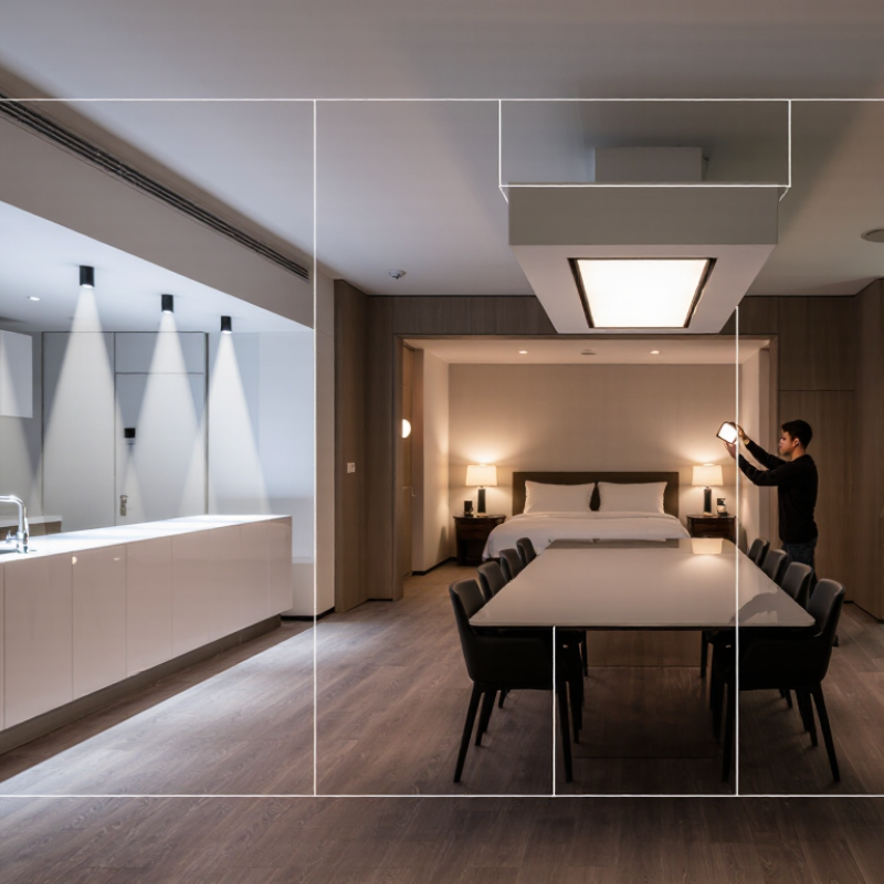
Good lighting design begins with a clear purpose, not a decorative fixture. Ask what people must see, how long they will use the space, and what mood supports their activities. A reading corner needs focused light, while a reception area may require softer, welcoming illumination. Write these goals before selecting equipment. Otherwise, visual appeal can hide practical problems.
User needs should guide every decision. Older visitors may need stronger, more even light and clearer contrast. Office workers can suffer from screen reflections when fixtures sit directly above monitors. In a kitchen, shadows under cabinets can make chopping unsafe. Observe the room at different times of day. Record daylight levels, user movement, and difficult visual tasks. Small details matter.
Functional requirements should be measurable. Define target brightness, color appearance, glare control, switching zones, and maintenance access. Local standards can provide useful reference values, but real conditions still require professional judgment. I once approved a layout that looked balanced on paper, yet a dark corridor appeared after installation. The calculations were reasonable. The observation was incomplete. Recheck plans with mock-ups or temporary lamps, and ask users what feels uncomfortable. Their feedback may challenge the original brief. Good lighting is not only what designers intend; it is what people can use safely, comfortably, and consistently.
Lighting failures often begin with furniture, not fixtures. I map doors, windows, shelves, and eye lines before choosing equipment. A ceiling plan alone misses shadows cast by tall cabinets. The International Energy Agency reports that buildings account for about 30% of global energy demand. Efficient lighting matters, but misplaced light still wastes energy. I prefer a quick daylight observation at 9 a.m., noon, and late afternoon. The room changes.
Natural light needs measurement, not optimism. A 2014 Journal of Clinical Sleep Medicine study found office workers with windows received 173% more daytime light and slept 46 minutes longer. That finding supports useful daylight, not uncontrolled glare. Check the desk surface with a light meter. Then inspect reflections on screens and glossy tables. Use blinds, diffusion, or repositioned desks when sunlight becomes a bright stripe. My own sketches sometimes overestimate winter daylight. That is worth admitting.
Task zones should guide brightness and beam direction. EN 12464-1:2021 lists 500 lux for many office reading tasks, while circulation areas require less. Do not apply 500 lux everywhere. High ambient levels can increase contrast problems and energy use. Place focused light over writing, cooking, grooming, or detailed assembly. Keep the background softer, but not dark. Test the space with real users, including someone wearing glasses. Walk around. Ask where eyes feel tired. Revise after dusk, when many design errors finally become visible.
Select fixtures according to the room’s purpose, not appearance alone. A narrow beam can highlight artwork, but it may create harsh shadows on a desk. For general lighting, choose fixtures that spread light evenly across floors and work surfaces. In kitchens, shielded fixtures reduce glare from polished counters. In bedrooms, indirect or diffused fixtures usually feel calmer. Check the fixture’s output, beam angle, mounting height, and maintenance access before installation.
Color temperature strongly affects comfort and attention. Warm white light, around 2700–3000K, often suits bedrooms, lounges, and dining areas. Neutral white light, around 3500–4000K, can support reading, grooming, and detailed tasks. Avoid mixing visibly different color temperatures in one small room. It looks accidental. I once specified bright neutral light for a quiet sitting area, and the space felt more like a clinic than a retreat. A sample installation would have exposed that mistake.
Set light levels for activities, then test them at night. A light meter provides useful evidence, but human comfort still matters. Place a book on the desk and check for reflections, shadows, and eye strain. Use dimming where daylight changes throughout the day. Do not rely on maximum output. Excessive brightness can make screens difficult to see and create strong contrast near darker walls. Local building requirements and professional lighting guidance should also shape the final choice, especially in shared or public spaces.
Good lighting starts with controls, not brighter fixtures.
Plan occupancy sensors, daylight dimming, and manual overrides together. A sensor should not switch off lights while someone reads quietly at a desk. That mistake frustrates users and encourages them to disable the system. ENERGY STAR reports that occupancy controls can reduce lighting energy use by 15–30% in suitable spaces. The result depends on accurate zoning and commissioning.
Layering also prevents common design errors. Combine ambient light with task lighting and limited accent light. A kitchen counter needs focused illumination, while corridors need comfortable, even brightness. The Illuminating Engineering Society recommends evaluating luminance contrast, not only fixture output. Excessive contrast can make a bright screen feel painfully dark.
I have found that a simple mock-up often reveals more than a polished drawing.
Glare reduction requires careful aiming, shielding, and surface selection.
Keep bright sources outside normal sightlines, especially near monitors and reflective tables. The International Energy Agency estimates that lighting accounts for roughly 15% of global electricity consumption, so efficiency deserves equal attention. High-efficacy LEDs help, but controls deliver savings only when people accept them. U.S. Department of Energy research shows connected lighting controls can produce substantial savings, though results vary by building use and installation quality. That uncertainty matters. Measure operating hours, review complaints, and adjust scenes after occupancy.
A perfect first design is unlikely.
A lighting plan can look perfect on paper and fail in a real room. I test every circuit before final installation. I switch fixtures on at different times of day. Morning daylight can reveal shadows that evening tests hide. A small lux meter helps confirm whether work surfaces receive even illumination. I also check glare from seated and standing positions. If the light reflects from a monitor, the design needs adjustment.
I once approved a hallway layout that felt balanced in drawings. On site, one recessed fixture sat directly above a door frame. The beam created a hard shadow across the entrance. Moving it only 20 centimeters improved the space noticeably. I also test dimming from the lowest setting upward. Flickering, delayed response, or sudden brightness often indicates an incompatible control system or excessive circuit load. These issues should be corrected before ceilings are closed.
Installation details deserve equal attention. Loose connections can cause heat, noise, or unreliable operation. A qualified electrician should verify wiring, grounding, junction boxes, and protection devices against local requirements. I inspect fixture alignment with a straightedge, especially in long rows. Small errors become obvious after the room is furnished. Color temperature should remain consistent between nearby fixtures. I sometimes focus too much on appearance and miss maintenance access. That mistake is costly. Leave enough space to replace lamps, clean lenses, and inspect connections safely. Test again after furniture, curtains, and reflective surfaces are in place. The room may behave differently then.
Furniture creates shadows, reflections, and blocked sightlines. Tall cabinets can darken desks. Map doors, windows, shelves, and eye lines first.
Observe the room at 9 a.m., noon, and late afternoon. The room changes. Use a light meter on the desk surface. Check screens and glossy tables for glare.
Use blinds, diffusion, or reposition the desk. Keep useful daylight. Avoid uncontrolled glare. My winter daylight sketches were too optimistic.
Match brightness to the activity. Reading and detailed work may need about 500 lux. Circulation areas usually need less. Do not make every area equally bright.
Place it above writing, cooking, grooming, or detailed assembly areas. Keep the background softer, but not gloomy. Walk around the room. Ask users where their eyes feel tired.
Choose fixtures for purpose, output, beam angle, height, and maintenance access. Wide distribution suits general lighting. Shielded fixtures can reduce kitchen glare. Diffused light often feels calmer in bedrooms.
Warm white, around 2700–3000K, often suits bedrooms, lounges, and dining rooms. Neutral white, around 3500–4000K, supports reading and detailed tasks. Avoid visibly mixed temperatures in small rooms. It looks accidental.
Daylight can hide design problems. Test a real book on the desk after dark. Check reflections, shadows, and eye strain. A sample installation may reveal an uncomfortable atmosphere.
Avoiding common lighting design mistakes begins with defining clear goals, understanding who will use the space, and identifying its functional requirements. Evaluate the room’s layout, available natural light, ceiling height, furniture placement, and task zones before choosing fixtures. Select lighting that matches each activity, using suitable light levels and color temperatures to support comfort, visibility, and atmosphere. A balanced plan should combine ambient, task, and accent lighting rather than relying on one source.
Lighting Design Mistakes To Avoid also include excessive glare, uneven illumination, poor switch placement, and unnecessary energy use. Plan controls that allow flexibility, such as separate zones or dimming, and position fixtures to reduce reflections and harsh shadows. Before completing the project, test the design at different times of day and under real working conditions. Correct issues such as flickering, dark corners, awkward shadows, exposed wiring, or inconvenient controls to ensure the final installation is safe, efficient, comfortable, and practical.

Boray Light